Blog
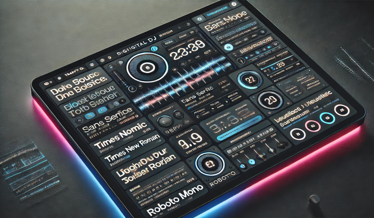
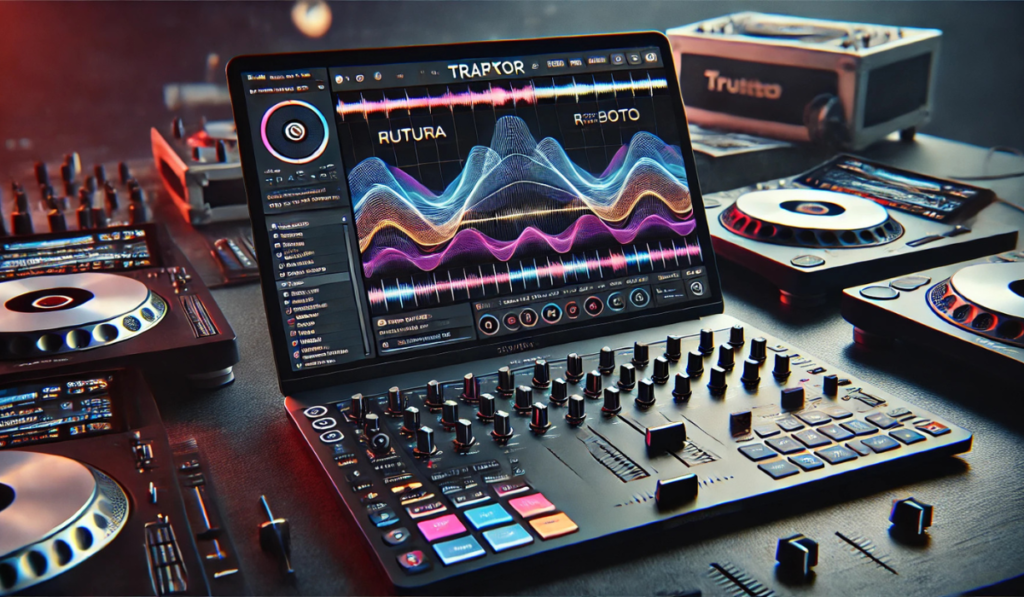
Best Traktor Font to Capture All Characters

Typography plays a significant role in digital design, tailoring visual communication to functionality and aesthetics. The font choice becomes pivotal for software like Traktor, a powerful and customizable DJ interface. A well-selected font enhances readability, ensures every character is evident, and effectively represents the DJ’s artistic expression.
If you’re a typography enthusiast seeking the best font for Traktor, you’re in the right place! This blog will provide the Best Traktor Font to Capture All Characters and a deep analysis of ideal font characteristics, popular font categories, and tips for customization and pairing—all to ensure your designs and DJ setup stand out while being highly functional.
What Makes the Best Traktor Font?
Before selecting the perfect font, one must understand the key characteristics that make a font suitable for Traktor. The proper font balances legibility, readability, and aesthetic appeal.
1. Legibility
Legibility ensures each character is uniquely identified, even in small sizes or under dim lighting (common in DJ setups). Fonts with the following features are highly legible:
- Precise Character Shapes: Letters and numbers should never be easily confused; for example, differentiating between “O” and “0” or “I” and “l” should be seamless.
- High Contrast: Fonts with clear distinctions between strokes (thick vs. thin) maintain visibility in various screen resolutions.
2. Readability
Readability refers to how easily an audience can scan through a text. With Traktor’s technical user interface, this feature is critical, especially for DJs making real-time decisions. Key readability elements include:
- Spacing Between Letters: Proper kerning ensures clarity without crowding characters.
- Optimal Line Height: Adequate line spacing prevents text from appearing cramped, even when details like track names or BPM values are listed.
3. Aesthetics
A visually appealing font reflects the DJ’s style and complements the modern, minimalistic Traktor UI. Look for:
- Modern Design: Clean, up-to-date fonts provide a professional and sleek look.
- Stylistic Flair: Fonts with personality add character and distinctiveness to your setup.
Popular Font Categories for Traktor
Fonts fall into several categories, with specific variations offering unique advantages for Traktor’s applications. Below, we’ve categorized the best options to ensure function and style.
Sans Serif Fonts
Sans serif fonts are clean, uncluttered, and perfect for modern designs. They are often utilized in advanced interfaces because of their effortlessness and flexibility. Popular options include:
- Futura: A geometric design that provides exceptional clarity and sophistication.
- Helvetica: Highly legible and widely adopted due to its balanced proportions.
- Univers: Offers clean lines and a range of weights for visual adaptability.
Serif Fonts
While serif fonts are less common in technical settings, they bring elegance and timeless appeal:
- Times New Roman: A traditional option with excellent readability for text-heavy sections.
- Baskerville: Combines classic design and sharp details for an elegant look.
- Garamond: A refined option perfect for aligning with artistic DJ branding.
Monospace Fonts
Monospaced fonts provide consistency, as each character occupies the same width, making them ideal for displaying technical data like track lengths or BPM:
- Courier New: A classic choice known for its simplicity and reliability.
- IBM Plex Mono: A versatile and contemporary option with exceptional clarity.
- Roboto Mono: Combines a modern aesthetic with high functionality.
Exploring Font Families

Going a step further, some font families, due to their specialized designs, are better suited for Traktor’s unique interface.
Geometric Sans Serif
These fonts prioritize clean, symmetrical shapes, adding a futuristic feel to your Traktor display:
- Avenir: Offers geometric precision alongside elegance, making it highly versatile.
- Gotham: A bold, modern font with excellent readability in various weights.
- Museo Sans: Combines simplicity with a distinctive flair for stylish displays.
Humanist Sans Serif
These fonts are more organic, mirroring natural handwriting for a friendly and approachable style:
- Gill Sans: Classic yet modern, ideal for a subtle design touch.
- Frutiger: Known for readability even at small sizes, perfect for digital interfaces.
- Myriad Pro: A widely recognized option with a balance of formality and friendliness.
Slab Serif
Combining the boldness of sans serif with a touch of tradition, slab serifs are great for making text stand out:
- Rockwell: A robust and noticeable choice, ideal for headers.
- Clarendon: Adds a touch of warmth and vintage charm to digital designs.
- Egyptienne: A strong and timeless option for versatile applications.
Tips for Font Customization
Customizing fonts allows you to tailor them to your needs, ensuring they align perfectly with your design goals and Traktor’s interface.
Weight Variations
Different weights offer flexibility:
- Light: For a sleek, modern, and minimalist appearance.
- Regular: The standard for clean, readable text in day-to-day use.
- Bold: Ideal for highlighting key information, like track names or BPM.
Italic Styles
Italics add movement and emphasis to the text. Two main options include:
- Oblique: Slanted text that’s simple while maintaining the original character shape.
- Cursive: Adds an artistic flair, great for labels or logos.
Ligatures and Alternates
Enhance typography with advanced details:
- Contextual Alternates: Adjust letter shapes based on their neighboring ones for a smoother look.
- Stylistic Sets: Offer alternative designs for select characters to emphasize creativity.
Font Pairing for Traktor
Matching textual styles decisively guarantees a decent and proficient result. This is how it’s done:
Complementary Combinations
Blend different categories for visual harmony:
- Serif + Sans Serif: A traditional serif font like Garamond paired with a sleek sans serif like Helvetica creates a professional look.
- Monospace + Proportional: Add contrast by pairing Roboto Mono with a proportional font like Avenir.
Contrasting Pairings
Leverage differences to strengthen visual impact:
- Modern + Traditional: Merge a contemporary typeface like Gotham with a classic option like Times New Roman for dynamic appeal.
- Geometric + Humanist: Pair the precision of Futura with the organic feel of Gill Sans for a balanced look.
Conclusion
Typography enhances Traktor’s user interface, bridging the gap between functionality and creativity. The right font will elevate your DJ experience, guiding your choices with clarity, readability, and an eye for aesthetics.
Now it’s your turn to experiment! Start with some of the suggestions in this blog and refine your Traktor display with fonts that reflect your unique style and technical needs. And remember, the world of typography has endless possibilities, so embrace it with creativity and confidence!
